“Focal Point” and “Negative Space”…read anything on the topic of design and you’re likely to see those words. As I’ve visited, and photographed, other people’s gardens I’ve noticed how an empty container, placed just so, seems to act as both; a focal point and negative space. At least to my way of seeing, and of course it’s only negative space when it’s left empty, something I don’t seem capable of doing (see a pot = put a plant in it).
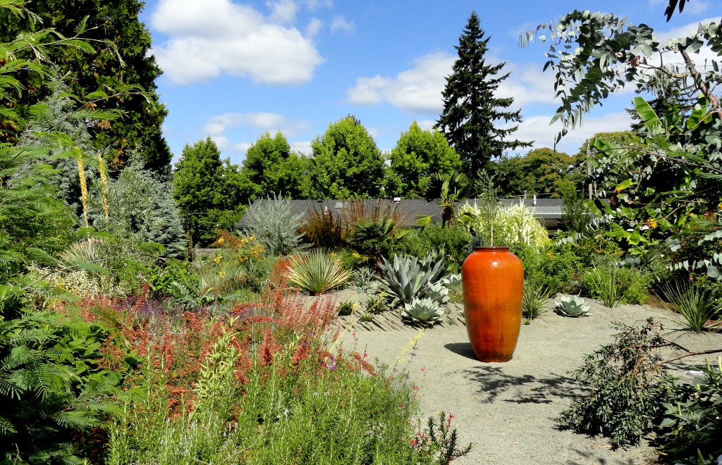
This bright orange/red container makes a great focal point, and since it’s placed at the convergence of several paths it also acts as a sort of wayfinding device.

And it wouldn’t be nearly as dramatic had it had been planted up.

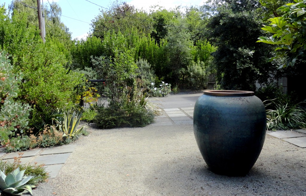
The openness of this front courtyard is less overpowering when your eye has a large blue urn to rest on.

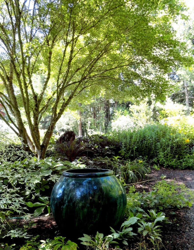
Here a smaller urn, partially obscured, gives you the feeling there might be more to this corner than meets the eye.

I haven’t always understood, or appreciated, the empty container. I thought them to be a little pretentious and artificial.

I’m not sure what finally opened my eyes to their magic.

This unglazed terracotta urn proves the color of clay can be just as powerful as an arresting red or bright blue.

And plain cement (or a light-weight version of) can be just as polished.

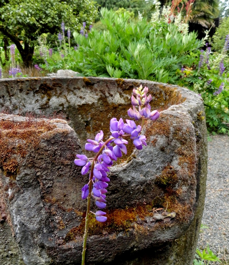
And empty doesn’t have to mean there isn’t any plant life in (on) the container.

Since you might be wondering about some of the plants near those empty containers…
