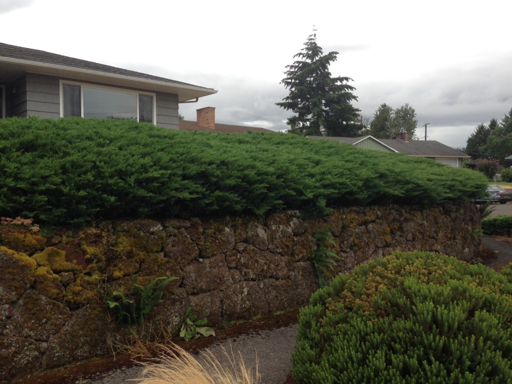
I had this idea I’d be outside working on a few winter-long projects, like removing the mass planted juniper. Turns out, it’s cold out there, and wet. So that means, time for indoor projects. 
I have lots of food ideas, continuing my lifelong quest for a healthier diet.
- Sweet Potato
- Spiralized Zucchini
- Fry it up in a Pan
And I’m making pretty good progress on the food front—with a special boost from the Spiralizer and Vitamix. Now that I’ve got caramelized onions with sautéed sweet potatoes and zucchini as “spaghetti” I’ll never use pasta again. Delicious.
- Ginger Tea, Sipping Vinegar & Wine
- The Man gets Cheese. No Dairy for Me.
- Deviled Eggs & Bubbly: We’re not Farmers.
I’m a week into goal of happy hour appetizers through December, new, healthy, creative bites. This month, we also have two birthdays, my husband’s and my daughter’s. And there’s Christmas—it’ll be fun trying to keep the kitties out of the tree. And I’m working on a new color scheme for the entire house. That’s all.
I love painting. But without fail, I back my way into that project, telling myself I’m just testing color and will do the actual painting later. Then the next thing I know, the house is in complete disarray, with patches of test color everywhere—except the room I’m wanting to get to in the first place: the kitchen & family room. Jury’s still out on that color.
- Bill has given up on suggestions
- Hallway: Too blue, then too gray
- Guest Room: Ah, just right
We painted the living room shortly after we moved in, because that room didn’t need anything else—and my thought was, we could consider it d-o-n-e. The fireplace bricks were painted an off white, the same color as the walls, so that gave me the freedom to repaint, a nice dark charcoal.

I wanted high contrast between the fireplace and the walls. And I had the idea that I’d use seaside tones in the rest of the house, sky and sand and dune grass colors. So began the just-the-right-color chase. I painted most of the fireplace three or four times until I allowed myself to get that really dark color I wanted, Gropius Gray from Miller Historic Colors.
I admit to being a bit manic over paint. For instance, I love the idea of turquoise, but have never successfully gotten it right. It always ends up looking too blue, or too green, or too garish. I tried five different blues before I gave up on that notion–and I asked the crew at Miller Paint to refuse me if I asked for more. Because truth is, I like shades from the warm side of the color wheel.

Still, I agonize, and test, and paint entire walls so that I can see. And almost without fail, I love the color as it’s going up, knowing it’s going to dry darker. I always think I won’t like it as much—and sometimes I go back and ask for the color it is when wet. Which is just about impossible.
I managed to finish the guest room yesterday. It’s a bright green called ‘Rain Boots’. Low hide, which means a minimum of three coats + considerable touch up. The color reminds me of new Vine Maple leaves, an ethereal chartreuse. It’s pretty bright in that room, but in the gray of winter, a most welcome sight. The sun came out for minute a day ago, and it almost glowed.
I like warm colors in plants too, usually selecting yellow and green over blue or silver. But once in a while, the blue shade is perfect, for instance Agave ‘Silver Surfer’ or that fabulous little spiky Spanish Fir I saw last week at Boring Bark. Their display gardens had every color of green and blue, and it looked so right. These colors can cozy up in the garden and look terrific, but not so much in the house. Or else I’m doing it wrong.
Once in a while, I’ll see a picture on line or in a magazine with a pure white color scheme. Like planting an all white-blooming garden. Oh, that’s pretty, I think—knowing full well I couldn’t live with it for long. Doesn’t mean I wont still try it, but days later, you’ll find me repainting the whole thing. Which is why I’m having so much trouble trying to coordinate the colors now from room to room. In my early days, I didn’t realize how much more bang you get for your buck in consider the color in an adjoining room. This is a theme in my life—as I consider the whole garden scheme too.

The fundamental problem in this current painting fiasco is the color I picked for the living room. It reads warm gray in the living room, with its two picture windows and a ton of light. But I’m not enamored of the way it shifts to a sort of blah green in the connecting hallway. I’m planning to change the hallway color for now, so it’ll be a lot more fun. But the walls are continuous into the entrance hall and living with no really good breaking point.
Pretty sure too, that the “done” living room isn’t far behind.


